Blog Detail Page
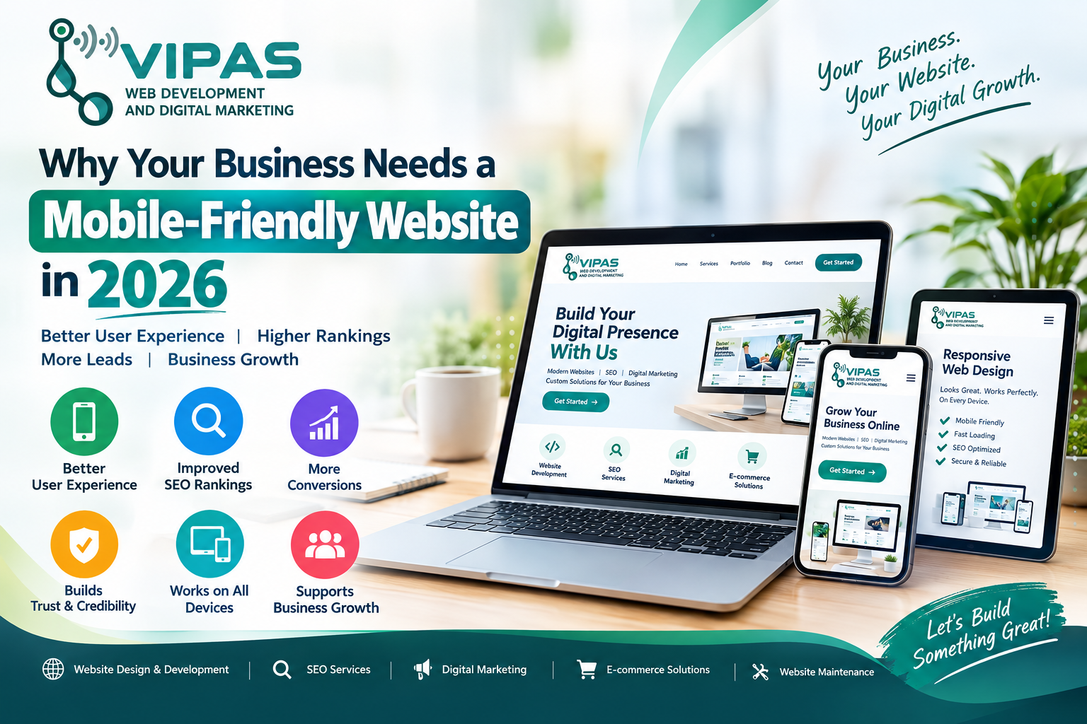
Why Your Business Needs a Mobile-Friendly Website in 2026
Introduction
The way people discover and interact with businesses has changed significantly. Customers now use smartphones to search for products, compare services, read reviews, contact companies, make bookings, and complete purchases.
This makes having a mobile-friendly website an important part of a modern business strategy.
A website that looks excellent on a desktop but is difficult to use on a smartphone can create a poor user experience. Visitors may leave quickly, search for another business, or decide not to contact you.
In 2026, businesses should focus on websites that are responsive, fast, easy to navigate, secure, accessible, and optimized for search engines.
What Is a Mobile-Friendly Website?
A mobile-friendly website is designed to provide a good experience on smaller screens such as smartphones and tablets.
A responsive website automatically adjusts its layout according to the user's screen size.
For example, a desktop website might display several columns and a large navigation menu. On a smartphone, those elements can reorganize into a single-column layout with a mobile navigation menu.
A mobile-friendly website should make it easy for visitors to:
- Read your content
- Navigate between pages
- View products and services
- Click buttons
- Submit enquiry forms
- Call your business
- Find your location
- Make bookings
- Complete online purchases
Why Does Your Business Need a Mobile-Friendly Website?
1. Customers Use Smartphones to Find Businesses
Smartphones have become an important tool for discovering local businesses, products, services, restaurants, hospitals, educational institutions, and professional services.
When someone searches for your business and opens your website, the experience should be smooth and simple.
If the website is difficult to navigate on a phone, visitors may leave before learning about your services.
A mobile-friendly website helps ensure that your business information is accessible wherever your customers are.
2. Responsive Design Improves User Experience
User experience is one of the most important parts of modern website design.
Visitors should not have to:
- Zoom in to read text
- Scroll horizontally
- Struggle to click buttons
- Search for contact information
- Wait unnecessarily for pages to load
Responsive web design adjusts the website layout to different screen sizes.
This creates a more consistent experience across smartphones, tablets, laptops, and desktops.
3. Mobile-Friendly Design Supports SEO
Search engines consider many factors when determining how pages appear in search results.
Mobile usability is an important part of creating a good search experience, but it should not be treated as a guarantee of higher rankings.
Your website should combine mobile-friendly design with:
- Helpful content
- Strong technical SEO
- Good page performance
- Clear website structure
- Relevant keywords
- Descriptive titles and headings
- Internal linking
- Secure HTTPS
- Quality backlinks
A mobile-friendly website gives your SEO strategy a stronger technical foundation.
4. Website Speed Matters
Mobile users may browse websites using different networks and devices.
A slow website can create frustration and increase the chance that visitors leave before completing an action.
Businesses should optimize:
- Images
- CSS and JavaScript
- Fonts
- Website hosting
- Caching
- Page structure
- Third-party scripts
Performance should be measured regularly using appropriate website performance tools.
5. A Professional Website Builds Trust
Your website is often one of the first places customers interact with your brand.
A modern website can communicate professionalism through:
- Clean design
- Consistent branding
- Clear navigation
- Professional images
- Customer testimonials
- Service information
- Contact details
- Secure forms
- Clear calls to action
If your website looks outdated or does not work properly on mobile devices, visitors may question the quality of the overall business experience.
6. Mobile Websites Can Generate More Leads
A business website should not simply provide information. It should also help visitors take action.
Depending on your business, useful mobile calls-to-action can include:
Call Now | WhatsApp | Get Quote | Book Appointment | Request Demo | Contact Us | Buy Now
Buttons should be easy to see and tap on smaller screens.
A well-designed mobile experience can make it easier for interested visitors to become enquiries or customers.
7. Mobile-Friendly Websites Help Local Businesses
Local customers frequently search for businesses, services, shops, clinics, restaurants, schools, and other organizations using their smartphones.
A mobile-friendly website can support your local digital presence by providing useful information such as:
- Business address
- Phone number
- Opening hours
- Services
- Products
- Google Maps location
- Customer reviews
- Appointment options
- WhatsApp contact
Your website and Google Business Profile can work together to provide customers with consistent business information.
8. Social Media Traffic Is Often Mobile
Businesses promote their websites through platforms such as Instagram, Facebook, YouTube, LinkedIn, and other digital channels.
Much of this traffic can come from mobile devices.
Imagine a customer sees your Instagram post and clicks your website link. If the website is difficult to use on their phone, you may lose a potential customer.
That is why social media marketing and mobile-friendly website development should work together.
9. Mobile Optimization Is Important for E-Commerce
For online stores, mobile usability can directly affect the shopping experience.
Customers should be able to:
- Find products
- View product details
- Check prices
- Select options
- Add products to cart
- Enter delivery details
- Complete payment
- Receive order information
If any of these steps becomes difficult on mobile, customers may abandon their purchase.
A responsive e-commerce website should therefore be designed around a simple and convenient mobile shopping experience.
What Makes a Website Mobile-Friendly?
A modern mobile-friendly website should include:
| Feature Why It Matters | |
| Responsive Design | Adapts to different screen sizes |
| Fast Loading | Improves user experience |
| Simple Navigation | Helps visitors find information |
| Readable Text | Makes content easier to consume |
| Touch-Friendly Buttons | Makes interaction easier |
| Optimized Images | Helps improve performance |
| Clear CTA Buttons | Encourages visitors to take action |
| Secure HTTPS | Protects website communication |
| SEO-Friendly Structure | Helps search engines understand content |
| Accessible Design | Makes the website easier for more users |
Mobile-Friendly Website vs Traditional Website
| Mobile-Friendly Website Non-Responsive Website | |
| Works across devices | Mainly designed for desktop |
| Automatically adapts | Layout may break on mobile |
| Easier navigation | Difficult navigation |
| Touch-friendly buttons | Small clickable elements |
| Better mobile experience | Poor mobile experience |
| Supports modern SEO practices | May create technical issues |
| Professional appearance | Can look outdated |
How to Check If Your Website Is Mobile-Friendly
Business owners should regularly test their websites on different devices.
Check your website using:
- Android smartphones
- iPhones
- Tablets
- Laptops
- Desktop computers
Look for problems such as:
- Text being too small
- Images overflowing the screen
- Buttons being difficult to click
- Menus not working
- Slow loading
- Horizontal scrolling
- Broken layouts
- Forms that are difficult to complete
You should also monitor your website performance and search visibility using tools such as Google Search Console and other website testing tools.
Mobile SEO: More Than Just Responsive Design
Having a responsive website is only one part of mobile SEO.
A strong mobile SEO strategy should also consider:
Technical SEO
Make sure search engines can properly crawl and understand your website.
Page Speed
Optimize resources and reduce unnecessary loading.
Content Quality
Create useful content that answers your customers' questions.
Internal Linking
Connect related pages to help users and search engines discover important content.
Metadata
Use relevant page titles and meta descriptions.
Structured Data
Where appropriate, use structured data to help search engines understand your content.
Local SEO
Businesses serving specific locations should maintain accurate business information and create useful local content.
What Should a Modern Business Website Include in 2026?
A professional business website can include:
Homepage
Clearly explain who you are, what you offer, and how customers can contact you.
About Us
Tell visitors about your company, experience, values, and team.
Services
Explain your services with clear descriptions and benefits.
Portfolio
Show previous projects and work examples.
Testimonials
Display genuine customer feedback where appropriate.
Blog
Publish useful articles that answer customer questions and attract organic search traffic.
Contact Page
Include phone, email, address, map, contact form, and other relevant contact methods.
Call-to-Action
Give visitors clear next steps such as Get a Quote, Call Now, Book Appointment, or Contact Us.
Why Professional Website Development Matters
Building a website is not simply about creating attractive pages.
A professional website should combine:
Design + Development + SEO + Performance + Security + User Experience + Marketing
A properly planned website can provide a strong foundation for your online presence.
Businesses should also regularly maintain their websites by updating content, checking links, improving performance, applying security updates, and monitoring search performance.
How VIPAS Can Help Your Business
At VIPAS Web Development and Digital Marketing, we help businesses create professional digital experiences designed for modern customers.
Our services include:
- Website Design & Development
- Responsive Web Design
- Business Website Development
- E-Commerce Development
- SEO Services
- Digital Marketing
- Website Maintenance
- Custom Web Applications
- Admin Panel Development
- Local Business Website Solutions
Whether you are starting a new business website or upgrading an existing website, the goal should be to create a website that is easy to use, mobile-friendly, search-friendly, and built around your business objectives.
Frequently Asked Questions
Is a mobile-friendly website necessary in 2026?
For most businesses, providing a good mobile experience is important because customers increasingly use mobile devices to browse websites, search for businesses, and interact with online services.
Does a mobile-friendly website guarantee Google rankings?
No. Mobile usability is only one part of SEO. Rankings depend on many factors, including relevance, content quality, technical factors, authority, user experience, and search context.
What is responsive web design?
Responsive web design is an approach where a website adapts its layout and elements to different screen sizes and devices.
Can an old website be made mobile-friendly?
Yes. Depending on the website's technology and structure, developers can redesign or rebuild it using responsive layouts and modern development practices.
Is mobile-friendly design important for small businesses?
Yes. A mobile-friendly website can help small businesses present their services professionally and make it easier for potential customers to contact them.
Conclusion
In 2026, your website is more than an online business card. It can be a powerful platform for visibility, customer communication, lead generation, sales, and brand growth.
A mobile-friendly website helps provide a better experience across smartphones, tablets, laptops, and desktops. When combined with useful content, technical SEO, strong performance, security, and effective digital marketing, it can become an important part of your business's digital strategy.
Build a website that works for your customers—wherever they are.
🚀 Build Your Digital Presence With VIPAS
VIPAS Web Development and Digital Marketing
Website Design • Development • SEO • Digital Marketing • E-Commerce Solutions
Your Business. Your Website. Your Digital Growth.
Related Post




Categories
Recent Post